
Technical · Change Request example
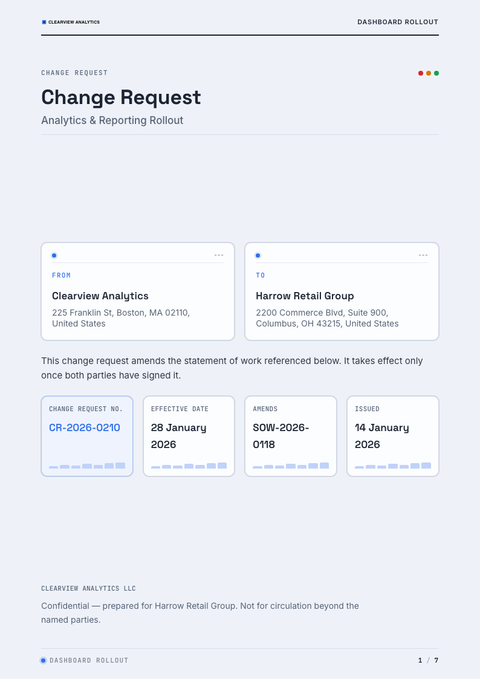
Data Visualization Change Request
Engineering / data / B2B brands; blueprint grid, data-bars, mono labels, dense precise layout.
Best forEngineering / data / B2B brands; blueprint grid, data-bars, mono labels, dense precise layout.
- Style
- Technical · Report
- Mood
- Technical · Precise · Data
- Typography
- Serif + sans
Rendered by Waxe — not a template

What's inside
The Data Visualization style sets the mood; this is the structure underneath. Waxe writes every section for you and lays it out to match your brand.
- Reference to original agreement
- Description of change
- Justification
- Impact on scope & deliverables
- Impact on cost & timeline
- Risk & options
- Approval & sign-off
A closer look at Data Visualization
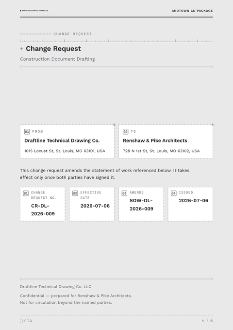
Some styles decorate a page. Data Visualization instruments it. Built for brands that think in metrics, it treats the change request like a technical readout — precise, dense, and organised around a blueprint grid rather than a narrative flow. The mood is engineering, not marketing: every mark on the page earns its place by carrying information.
Fine grid lines sit under the content like graph paper, with data-bars, mono-set labels and tables doing the visual heavy lifting instead of imagery. The font pairing can run either serif or sans, but it's always set with technical restraint — tabular figures, consistent baselines, nothing decorative competing with the numbers. Colour is used sparingly, mostly to code categories rather than to charm.
It's the natural choice for engineering, data and B2B brands who want a change request that reads as evidence rather than persuasion — figures backed by working shown, not just asserted. Reach for it whenever the content itself is quantitative and deserves to be taken at face value.
What distinguishes this style as a change request is how much trust it builds through restraint — readers stop questioning the numbers because the layout looks built to be checked, not sold. The one thing to watch is over-filling the grid; even a technical page needs white space to keep the density legible.
The figures and charts in this example are illustrative, standing in for whatever numbers matter to the reader. Ask Waxe to build the real thing and it carries your own brand system and data into a change request that's ready to send, not just admire.
Data Visualization across your paperwork
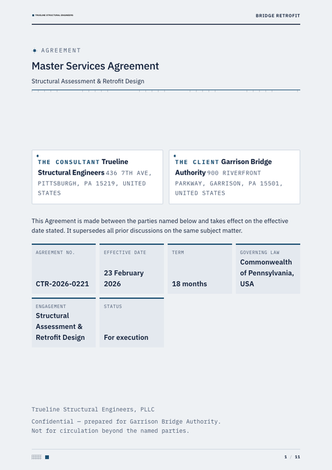
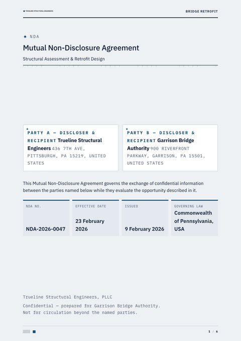
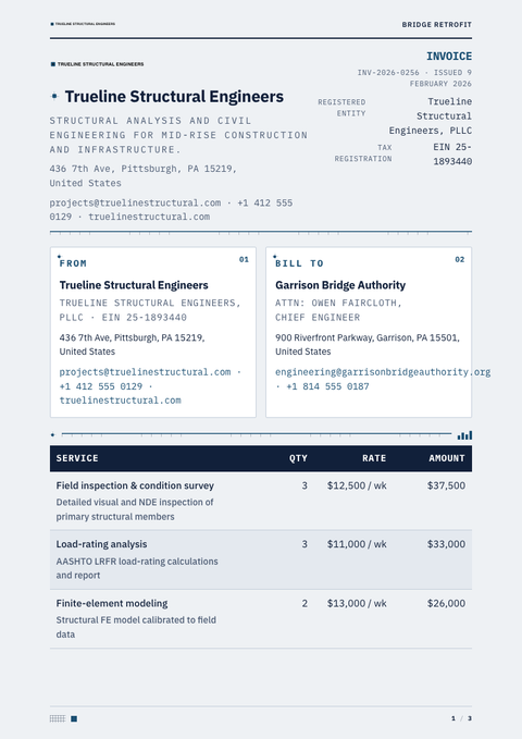
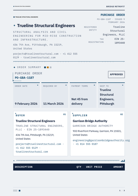
One look, every document. The same Data Visualization treatment, applied to the rest of what you send.
More styles


Make this change request yours
Generate a Data Visualization change request with your brand, your content and your logo — finished and ready to send.