
Typographic · Invoice example
Typographic / Type-led Invoice
Brands whose voice IS the typography — publishers, studios, foundries, cultural and editorial work.
Best forBrands whose voice IS the typography — publishers, studios, foundries, cultural and editorial work. A type-system-led specimen: a contrast serif pairing exploited across weights and italics, drop-caps, oldstyle and tabular figures as ornament, hung punctuation and a fine baseline rhythm, mostly monochrome on warm paper with a single restrained ink accent.
- Style
- Type · Specimen
- Mood
- Typographic · Editorial · Refined
- Typography
- Serif
Rendered by Waxe — not a template

What's inside
The Typographic / Type-led style sets the mood; this is the structure underneath. Waxe writes every section for you and lays it out to match your brand.
- Invoice number & dates
- From & bill-to details
- Itemised line items
- Subtotal, tax & discount
- Total due
- Payment instructions
- Notes & references
A closer look at Typographic / Type-led
Typographic makes the case that type alone can carry a invoice, with no imagery or ornament required to make the point. It is the most literary style in the set — the confidence of trusting the words and the letterforms to do the work unaided.
A contrast serif runs the whole system, exploited across weight and italic to build hierarchy the way a foundry specimen would, with drop caps opening sections and oldstyle and tabular figures used almost as ornament in their own right. Hung punctuation and a fine baseline rhythm keep it disciplined, mostly monochrome on warm paper with one restrained ink accent.
Publishers, studios, foundries and cultural or editorial work are this style's core audience, anywhere the brand's voice genuinely is its typography rather than a colour or a mark. It suits a invoice meant to be read closely, one that should feel like considered prose rather than plainly formatted text.
The drop caps do more than announce a start: paired with the tabular figures elsewhere on the page, they give a invoice an actual reading rhythm, section by section, rather than a flat scroll of paragraphs. That rhythm is why this style rewards a second read, not just a first glance.
The specimen here is a demonstration setting. Generate a invoice of your own and Waxe rebuilds the same type system around your brand's actual fonts, colours, logo and content, returning an export-ready invoice with the discipline intact and the voice entirely yours.
Typographic / Type-led across your paperwork
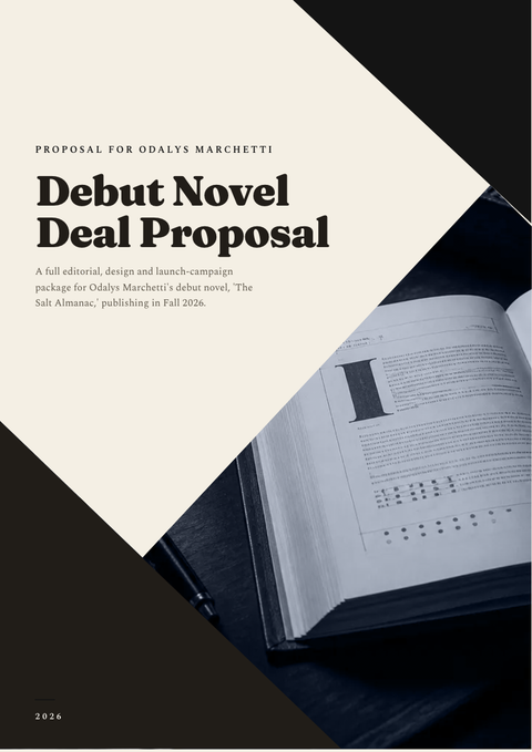
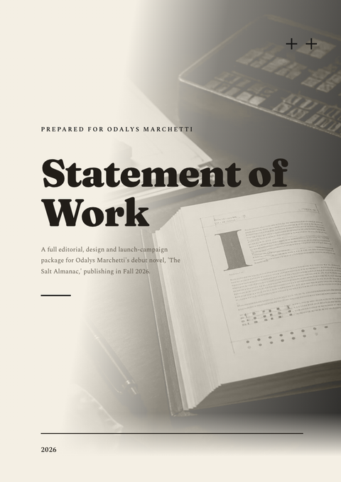
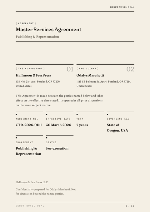
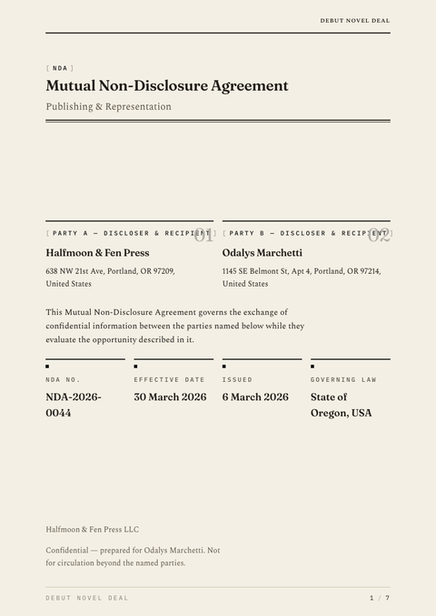
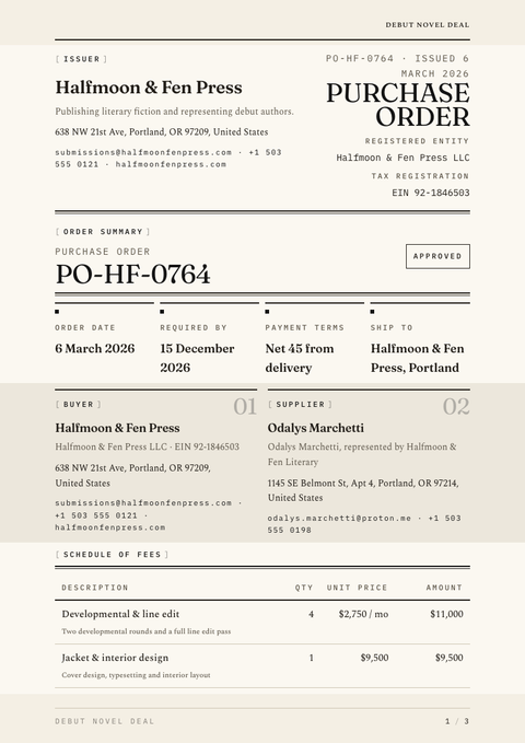
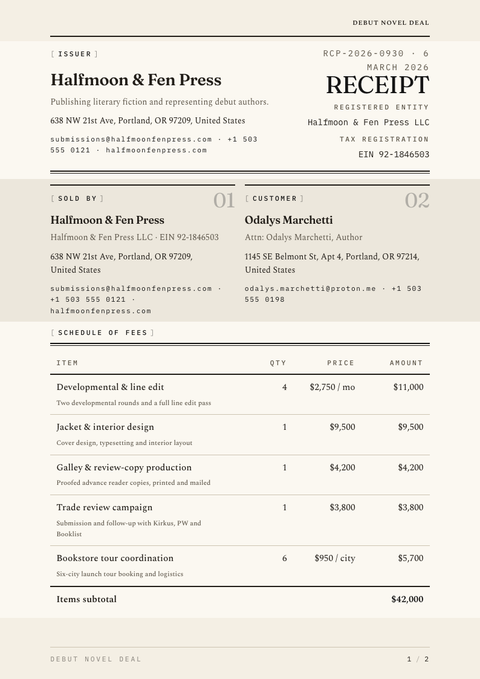
One look, every document. The same Typographic / Type-led treatment, applied to the rest of what you send.
More styles


Make this invoice yours
Generate a Typographic / Type-led invoice with your brand, your content and your logo — finished and ready to send.