
Technical · Proposal example
Infographic Proposal
Data-storytelling brands, reports and explainers that should look like a friendly infographic:
Best forData-storytelling brands, reports and explainers that should look like a friendly infographic: a bright multi-colour categorical palette, circular icon badges, big bold figures in donut rings, numbered connector flows and rounded colour-coded sections.
- Style
- Colourful · Data · Story
- Mood
- Colourful · Friendly · Data Driven
- Typography
- Sans-serif
Rendered by Waxe — not a template

What's inside
The Infographic style sets the mood; this is the structure underneath. Waxe writes every section for you and lays it out to match your brand.
- Problem & desired outcome
- Recommended approach
- Scope of work
- Phased timeline
- Commercial terms
- About us & case studies
- Next steps & call to action
A closer look at Infographic
Infographic turns a proposal into something you read the way you would read a good chart: at a glance, then again for the detail. It is the friendliest of the technical styles, built to make numbers feel welcoming rather than dense.
Colour does the organising, with a bright multi-hue palette assigning each section its own identity, circular icon badges marking topics, and headline figures sitting inside donut rings for instant emphasis. Numbered connector flows walk the eye through sequence, and a clean sans keeps the labelling calm underneath all the colour.
Data-driven brands and explainer content are where this earns its keep, anywhere a non-specialist reader needs to follow numbers without a walkthrough. Whenever a proposal has to prove something with figures and the audience will not sit through a wall of prose to get there, this is the style to pick.
The donut rings are doing more than decoration: because a headline figure sits inside its own coloured ring rather than loose on the page, a reader can scan a proposal for the two or three numbers that matter without reading a single sentence, which is the entire promise of the style kept.
The figures here are illustrative only. Generate a proposal from your own numbers and Waxe rebuilds every ring, badge and connector around your real data, brand colours, type and logo, handing back an export-ready proposal that tells your story rather than a sample one.
Infographic across your paperwork
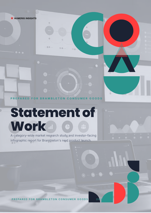
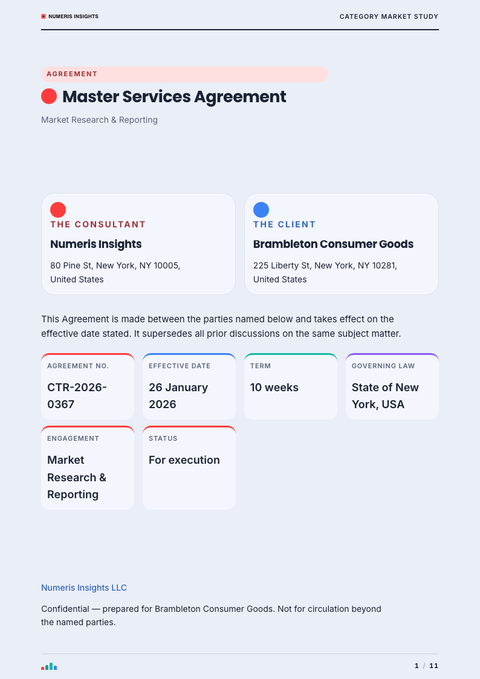
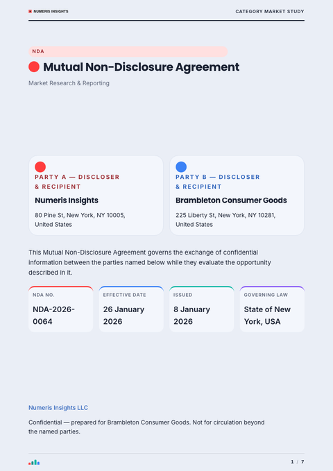
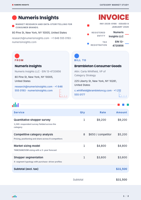
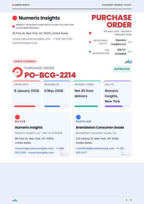
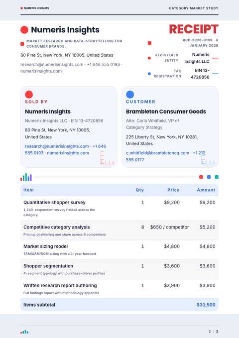
One look, every document. The same Infographic treatment, applied to the rest of what you send.
More styles


Make this proposal yours
Generate a Infographic proposal with your brand, your content and your logo — finished and ready to send.