
Color · Purchase Order example
Duotone Purchase Order
Brands wanting a committed two-colour graphic identity; exactly two contrasting inks mapped to shadow + highlight, carried across every block and into a true duotone photo treatment.
Best forBrands wanting a committed two-colour graphic identity; exactly two contrasting inks mapped to shadow + highlight, carried across every block and into a true duotone photo treatment. Great for confident, design-forward presentations and brand systems.
- Style
- Two · Tone · Graphic
- Mood
- Bold · Graphic · Contrasty
- Typography
- Sans-serif
Rendered by Waxe — not a template

What's inside
The Duotone style sets the mood; this is the structure underneath. Waxe writes every section for you and lays it out to match your brand.
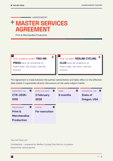
- PO number & order date
- Buyer & supplier details
- Itemised order table
- Quantities & totals
- Delivery terms & date
- Shipping & billing addresses
- References & authorisation
A closer look at Duotone
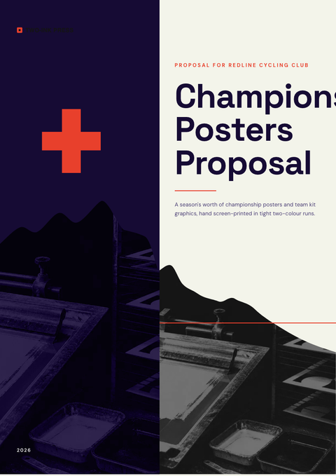
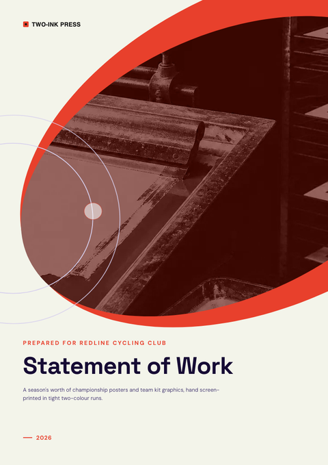
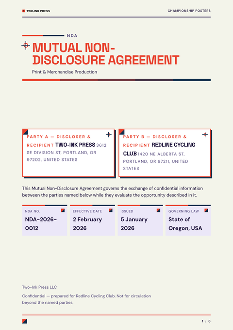
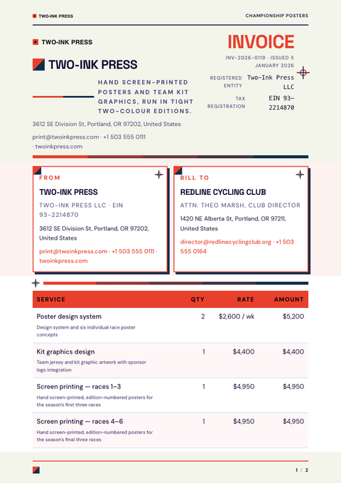
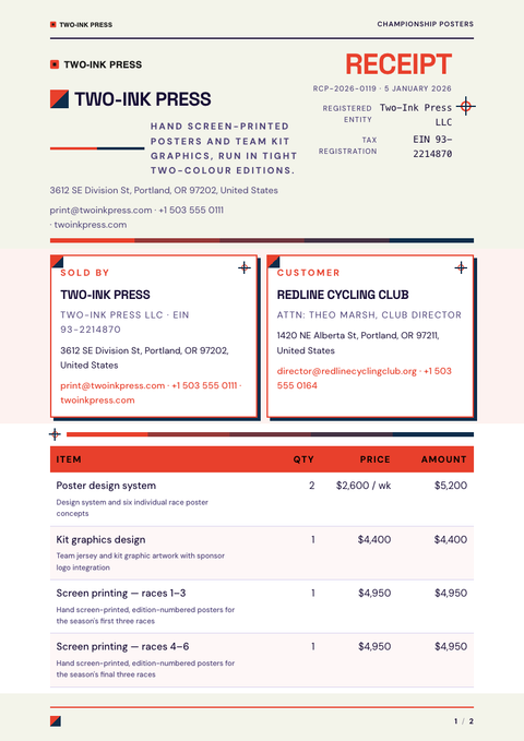
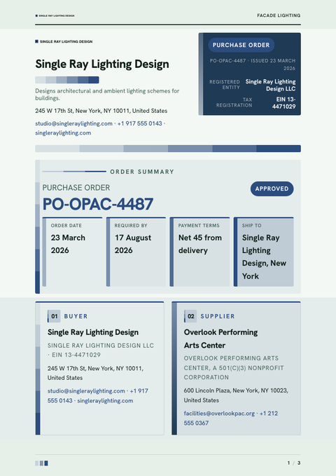
Two colours and nothing else — that is the whole premise of Duotone, one mapped to shadow, one to highlight, carried across every part of a purchase order without exception. The discipline is the point: nothing here is accidental, and nothing is left to compete with the palette.
Every block, rule and photograph is mapped to the same two inks, including a true duotone treatment for any imagery, so the page reads as one continuous surface rather than a set of separate parts. Type is sans throughout, kept plain and confident so the colour pairing carries the visual weight instead of ornament.
This is the natural register for brands that already know exactly who they are — design-forward studios, agencies, and companies presenting a considered brand system. Reach for it whenever a purchase order needs to look deliberate and assembled rather than thrown together under deadline, and confidence matters more than variety.
Because there are only two inks in play, hierarchy has to come from value and weight rather than a third accent colour, so a well-chosen pairing does noticeably more work here than in a fuller palette. Get that contrast right and a purchase order looks inevitable rather than merely restrained.
The two inks used here are simply this demonstration's pick, not a fixed palette. Run a purchase order through Waxe and it selects a duotone from the reader's own brand colours, rebuilds the type and logo to match, and hands the document back ready to export.
More styles

Make this purchase order yours
Generate a Duotone purchase order with your brand, your content and your logo — finished and ready to send.