
Futuristic · Receipt example
Futurism Receipt
AI, deep-tech, aerospace, mobility and forward-leaning corporate brands wanting a sleek future-tech feel:
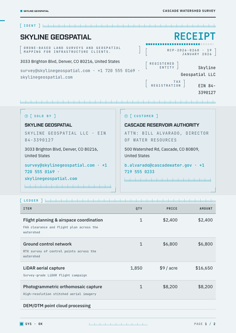
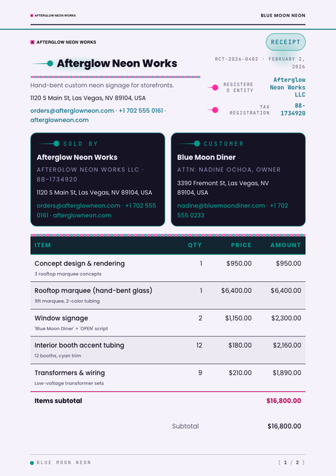
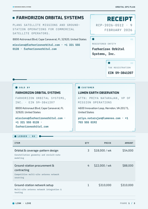
Best forAI, deep-tech, aerospace, mobility and forward-leaning corporate brands wanting a sleek future-tech feel: a cool steel-and-ice ground, one energetic velocity-blue accent, angular cut-corner panels, diagonal speed/motion lines and dynamic meter bars, with a precise technical sans. Clean and bright, never neon-on-black.
- Style
- Metallic · Kinetic
- Mood
- Sleek · Kinetic · Futuristic
- Typography
- Serif + sans
Rendered by Waxe — not a template

What's inside
The Futurism style sets the mood; this is the structure underneath. Waxe writes every section for you and lays it out to match your brand.
- Receipt & transaction number
- Payment date
- Paid-by & paid-to details
- Itemised summary
- Total paid
- Payment method
- Paid confirmation
A closer look at Futurism
Futurism is what confidence looks like when it's been machined rather than decorated. Sleek, kinetic and precise, it gives a receipt the bearing of something engineered, closer to a concept-car brief than an ordinary printed page. Every surface looks tooled rather than printed, from the panel edges to the type.
A cool steel-and-ice ground carries one disciplined accent, a velocity blue, cut through with angular panels and diagonal speed lines. Meter bars and dynamic indicators suggest motion even where the receipt is standing still, and a precise technical sans keeps every line looking measured rather than improvised.
It suits organisations working at the sharper end of technology: aerospace, mobility, deep-tech, AI, anywhere the reader should sense forward motion and competence before they've read a word. It's for brands wanting future-facing without tipping into fantasy, confident enough to let one accent colour carry the whole message.
The detail worth noting in a receipt is that this reads bright and clean rather than dark and neon. The panels and accent colour do the futuristic work while the page itself stays legible and calm, which is what keeps a receipt usable as a working document rather than a poster.
This is one build of the style, shown to demonstrate the system. Point Waxe at your own brand and it reconstructs the same cut-corner, velocity-blue language around your palette and content, producing a receipt that's ready to send rather than just ready to look at.
Futurism across your paperwork
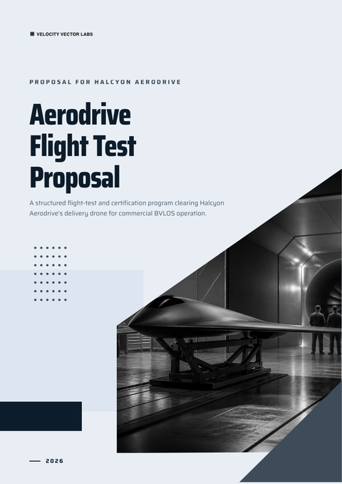
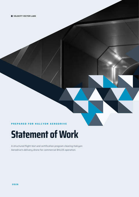
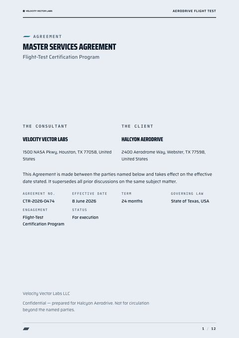
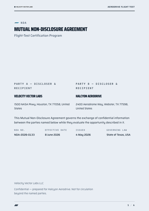
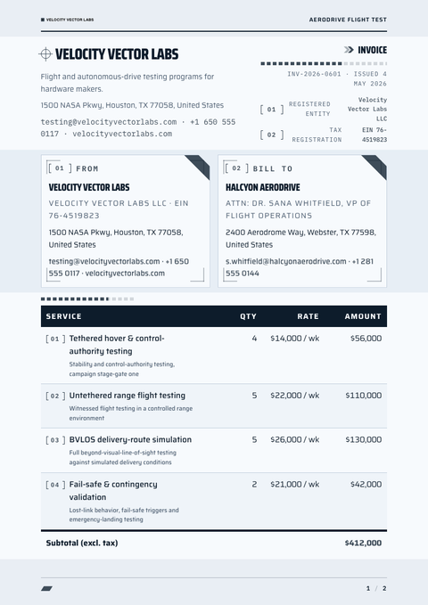
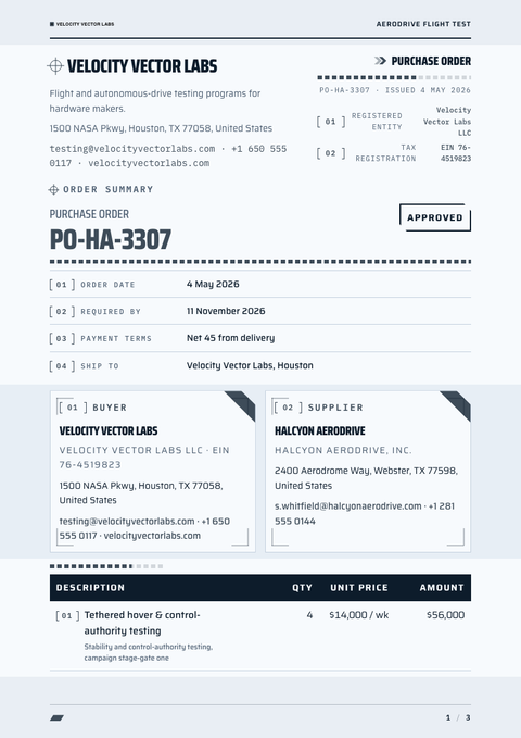
One look, every document. The same Futurism treatment, applied to the rest of what you send.
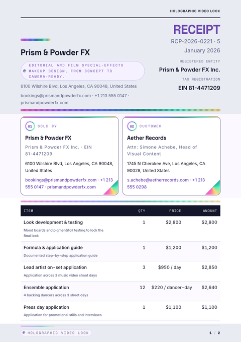
More styles


Make this receipt yours
Generate a Futurism receipt with your brand, your content and your logo — finished and ready to send.