
Brutalist · Requirements Document example
Brutalism Requirements Document
Brands that want to look uncompromising and structural — exposed grids, heavy black rules, hard-offset boxes, typewriter labels and one acid accent.
Best forBrands that want to look uncompromising and structural — exposed grids, heavy black rules, hard-offset boxes, typewriter labels and one acid accent. Strong for tech, culture, zine and anti-corporate voices.
- Style
- Raw · Structural
- Mood
- Raw · Stark · Bold
- Typography
- Monospace
Rendered by Waxe — not a template

What's inside
The Brutalism style sets the mood; this is the structure underneath. Waxe writes every section for you and lays it out to match your brand.
- Overview & objectives
- Scope & context
- Functional requirements
- Non-functional requirements
- Acceptance criteria
- Assumptions & constraints
- Out-of-scope
A closer look at Brutalism
Strip away every flourish and what's left is Brutalism — a look that trusts structure alone to carry meaning. It exposes its grid rather than hiding it, favouring heavy black rules and hard-offset boxes over anything decorative. The effect on a requirements document is stark and unpolished on purpose, industrial in temperament.
Colour is nearly absent — black, white, and one acid accent doing all the work of emphasis. Layout is built from typewriter labels, boxed sections and rules that look drawn with a ruler rather than software. Monospace type carries the whole page, giving even routine content the clipped, deadpan cadence of a field report.
It suits brands that want to look uncompromising — tech products, cultural institutions, zines, anti-corporate voices who'd rather look assembled than designed. Choose it when the requirements document needs to feel direct and a little confrontational, cutting through the politeness of conventional business writing.
The trick with Brutalism as a requirements document is that the rawness is entirely engineered — every hard edge and offset box is placed with more precision than a softer style would need, because there's nowhere to hide a mistake. Get the grid right and the starkness reads as confidence, not neglect.
What's shown here is one deliberately narrow palette; the style itself is a system, not a fixed look. Bring your brand's colours and mark to Waxe and it rebuilds the grid around them, keeping the structural bite while making the requirements document unmistakably yours.
Brutalism across your paperwork
One look, every document. The same Brutalism treatment, applied to the rest of what you send.


More styles
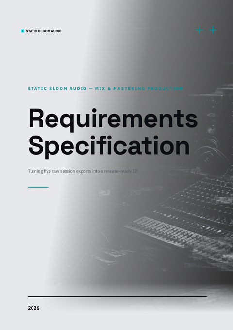
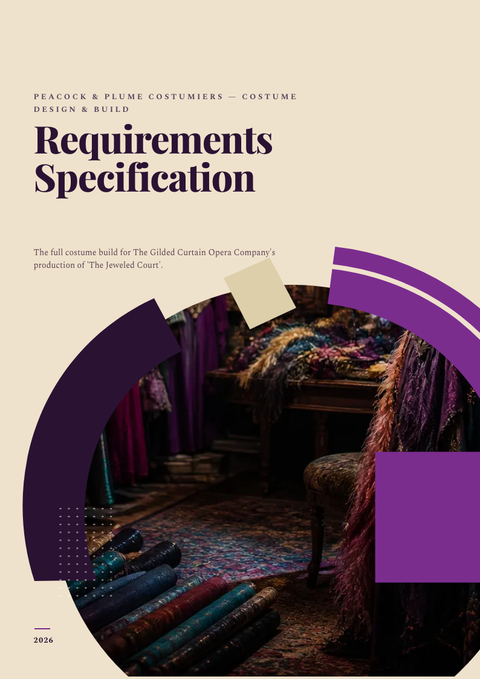


Make this requirements document yours
Generate a Brutalism requirements document with your brand, your content and your logo — finished and ready to send.