
Color · Scope of Work example
Black and White Scope of Work
Brands wanting a confident, timeless gallery/fashion look in pure black, white and grey:
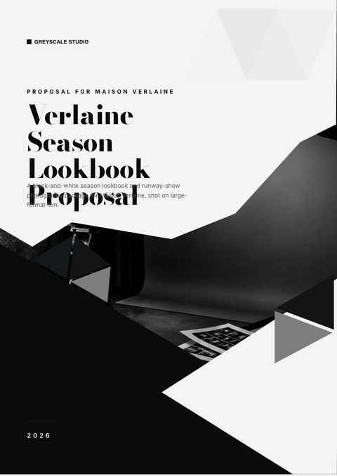
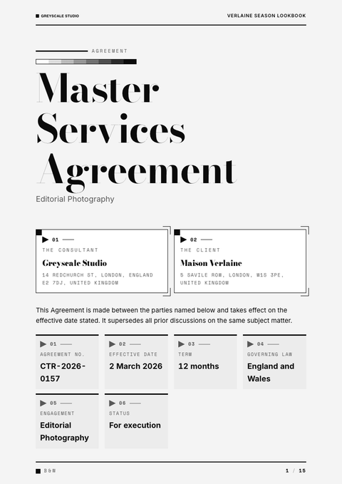
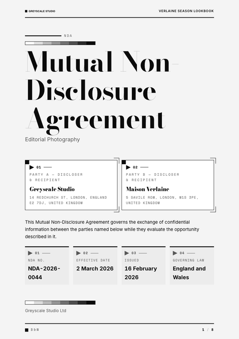
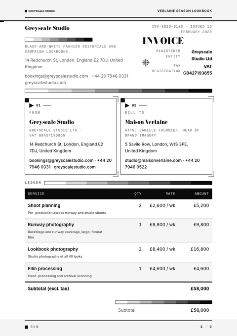
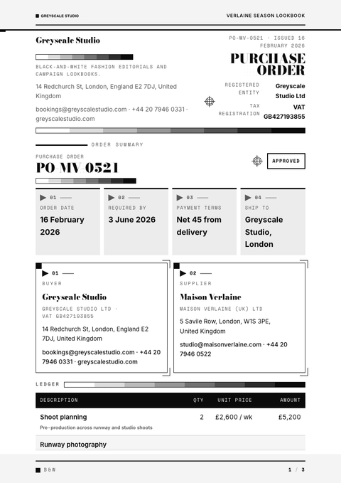
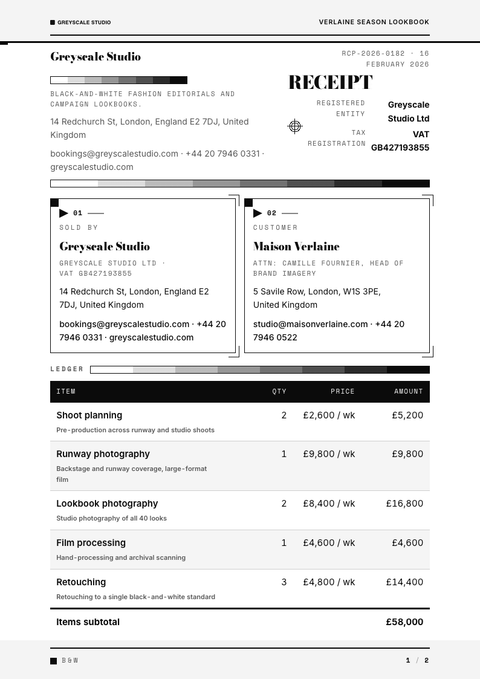
Best forBrands wanting a confident, timeless gallery/fashion look in pure black, white and grey: dramatic high-contrast type, reversed black plates, photographic monochrome. No colour at all.
- Style
- Stark · Monochrome
- Mood
- Monochrome · High Contrast · Editorial
- Typography
- Serif + sans
Rendered by Waxe — not a template

What's inside
The Black and White style sets the mood; this is the structure underneath. Waxe writes every section for you and lays it out to match your brand.
- Project summary & objectives
- Itemised workstreams & effort
- Deliverables
- Milestones & timeline
- Acceptance criteria
- Assumptions & dependencies
- Out-of-scope & exclusions
A closer look at Black and White
Black and White dispenses with colour altogether and asks contrast to do all the talking. What remains is stark, editorial and faintly theatrical, the kind of composure you find in a gallery catalogue or a fashion house's press pack, where nothing needs decoration to hold attention.
The page works in reversed plates and hard-edged blocks: deep black grounds carrying white type, or pale fields interrupted by a single black bar. Photography, where it appears, sits in true monochrome. With fontBias set to either, the typeface can lean serif for gravitas or sans for cool precision, but weight and scale carry the hierarchy rather than hue.
It suits brands with a timeless, confident bearing, the kind who'd rather be remembered for restraint than noise: architecture practices, fashion labels, galleries, auction houses, anyone whose scope of work needs to look considered rather than persuaded into shape. Reach for it when the content itself is strong enough to stand without colour propping it up.
The trick with a scope of work in this style is knowing that every grey has to earn its place. With only black, white and grey on the page, hierarchy comes from contrast and spacing alone, so a crowded layout collapses fast while a sparse one reads as deliberate.
What's shown here is one rendering of the idea, not a finished brand. Generate a scope of work through Waxe and it rebuilds the same monochrome discipline around your own logo, type and content, then hands back something export-ready, with contrast doing the work colour usually would.
More styles


Make this scope of work yours
Generate a Black and White scope of work with your brand, your content and your logo — finished and ready to send.