
Color · Portfolio example
High Contrast Portfolio
Brands wanting maximal-legibility punch:
Best forBrands wanting maximal-legibility punch: pure black + white with one electric accent, thick rules, big bold type, accessibility-forward and impossible to ignore.
- Style
- Bold · Vibrant
- Mood
- Bold · High Contrast · Accessible
- Typography
- Sans-serif
Rendered by Waxe — not a template

What's inside
The High Contrast style sets the mood; this is the structure underneath. Waxe writes every section for you and lays it out to match your brand.
- Introduction
- Selected case studies
- Challenge, work & result
- Capabilities summary
- Process & approach
- Recognition & credibility
- Contact & call to action
A closer look at High Contrast
No half-measures here. High Contrast reduces a portfolio to two neutrals and a single jolt of colour, and lets the absence of anything else do the talking. It's blunt, confident and built to be read from across a room, with nothing decorative left to hide behind.
Thick rules divide the page like structural beams, headings run big and bold in a plain sans, and the one accent colour appears only where it needs to be noticed. There's no gradient, no texture, no middle grey to soften the transitions, just clean edges and flat fields doing all the work.
It suits brands that want to be impossible to overlook and mean it literally, including anyone who needs a genuinely accessible, high-legibility system rather than one that merely looks accessible. Good for portfolios meant to be read fast, at a glance, without squinting.
The strength of this look as a portfolio is that legibility and boldness are the same decision here, not a trade-off: the contrast that makes it striking is also what makes it easy to read at speed. Push the accent colour too far, though, and it stops directing attention and starts fighting for it.
Consider this the demonstration, not the deliverable. Generate your own portfolio and Waxe carries the same black-white-and-one-accent structure across into your brand's actual colour, type and logo, exporting something ready to send under your own name.
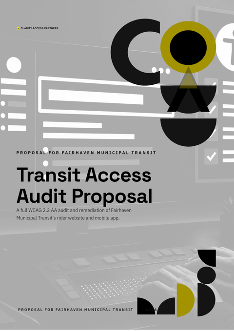
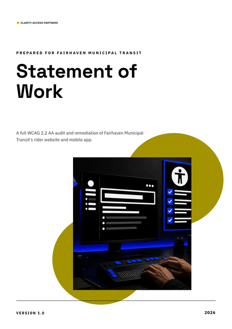
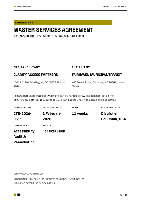
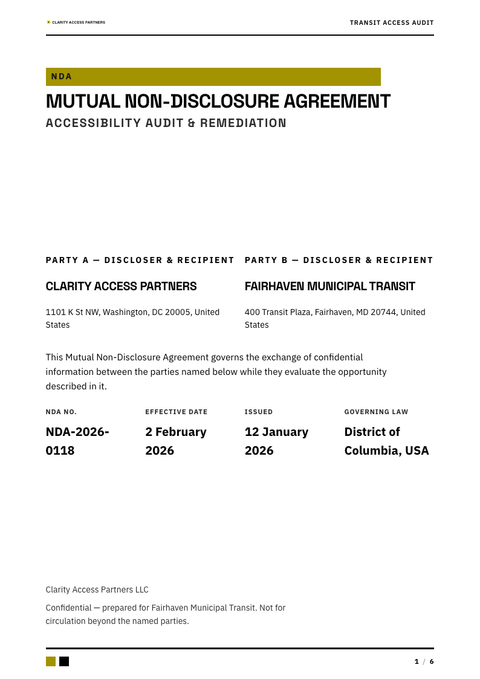
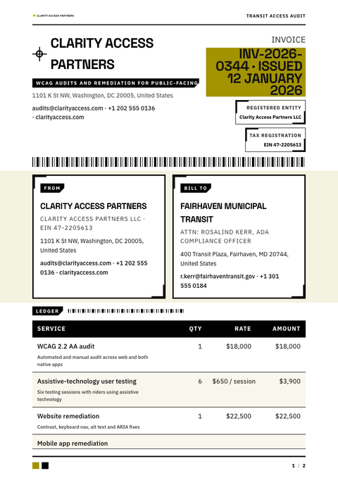
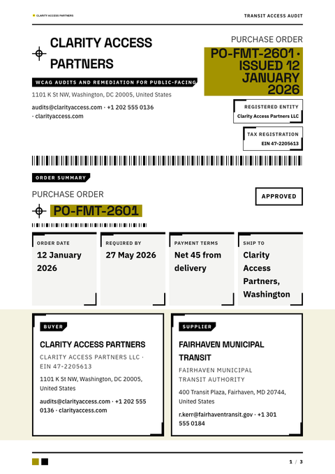
High Contrast across your paperwork
One look, every document. The same High Contrast treatment, applied to the rest of what you send.
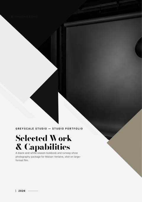
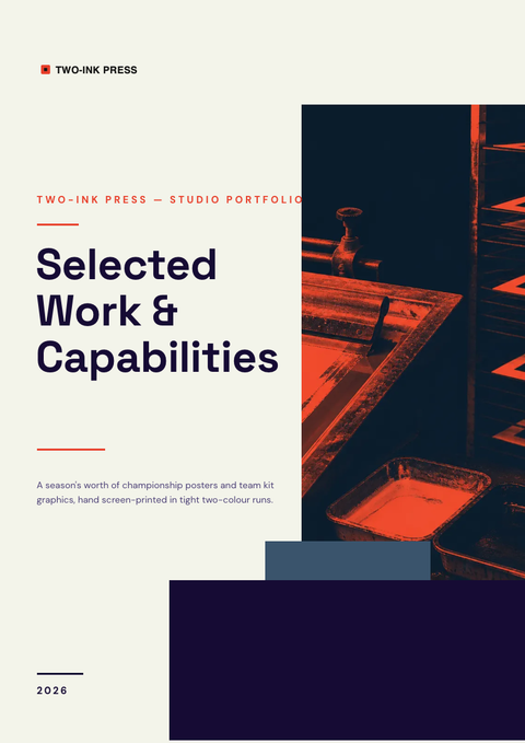
More styles

Make this portfolio yours
Generate a High Contrast portfolio with your brand, your content and your logo — finished and ready to send.