
Color · Portfolio example
Pastel / Soft Portfolio
Consumer, lifestyle, beauty, kids and social-first brands wanting a gentle, sweet, airy feel; a rotating multi-pastel candy palette (mint, lavender, peach, butter, baby-blue), rounded soft shapes and soft tinted shadows on a deep-ink reading colour.
Best forConsumer, lifestyle, beauty, kids and social-first brands wanting a gentle, sweet, airy feel; a rotating multi-pastel candy palette (mint, lavender, peach, butter, baby-blue), rounded soft shapes and soft tinted shadows on a deep-ink reading colour.
- Style
- Soft · Pastel
- Mood
- Soft · Playful · Dreamy
- Typography
- Sans-serif
Rendered by Waxe — not a template

What's inside
The Pastel / Soft style sets the mood; this is the structure underneath. Waxe writes every section for you and lays it out to match your brand.
- Introduction
- Selected case studies
- Challenge, work & result
- Capabilities summary
- Process & approach
- Recognition & credibility
- Contact & call to action
A closer look at Pastel / Soft
Pastel is the sweetest style in the set, built from a candy-box range — mint, lavender, peach, baby-blue — rather than a single corporate hue. The mood stays light throughout, closer to a treat than a transaction.
Soft, rounded shapes replace hard rules wherever possible, colours rotate section by section rather than repeating one tint, and tinted shadows sit low and gentle under cards instead of anything sharp. A deep-ink reading colour keeps the actual text crisp, so the softness stays decorative rather than swallowing legibility.
Consumer, beauty, kids' and social-first brands are the natural fit, anywhere the reader is a customer rather than a committee. Warmth does more persuading than authority in these settings, and a portfolio in this register invites rather than instructs.
The colour rotation is the detail worth noticing: because each section takes its own pastel rather than repeating one tint down the page, a portfolio gains a visual rhythm that guides the eye from part to part without a single heavy divider anywhere. It is softness doing structural work, not just mood.
The palette shown here is a taster only. Generate your own portfolio and Waxe mixes its pastel rotation around your actual brand colours, type, logo and content, returning an export-ready portfolio that keeps the sweetness while speaking entirely in your voice.
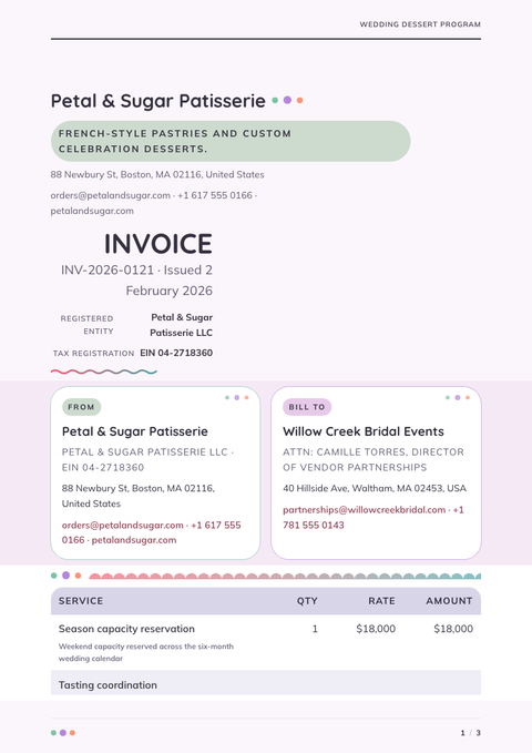
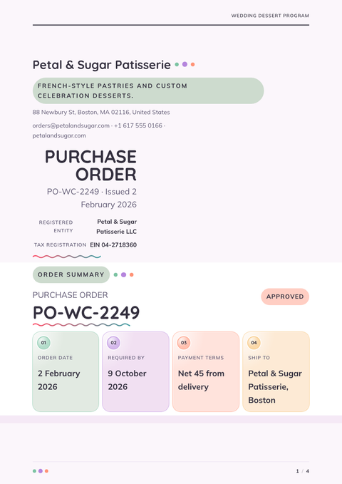
Pastel / Soft across your paperwork
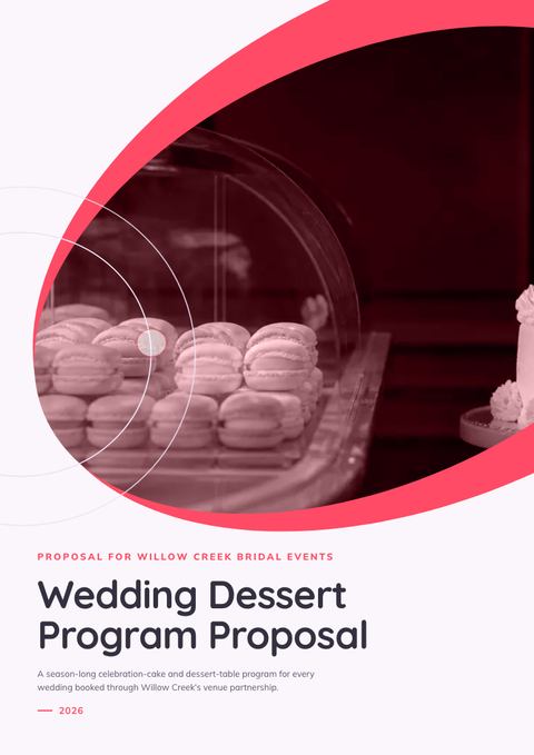
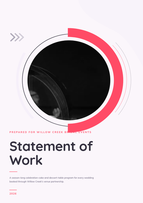
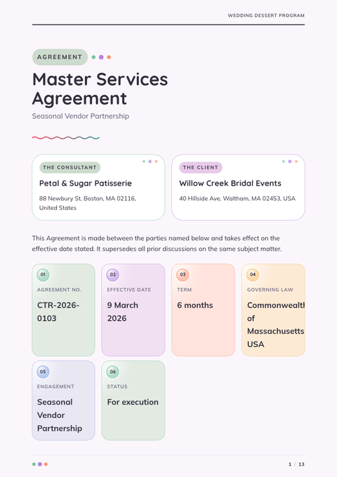
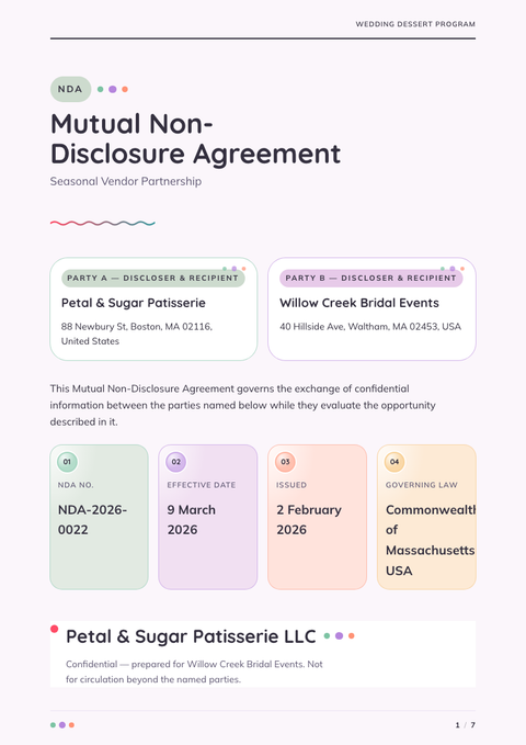
One look, every document. The same Pastel / Soft treatment, applied to the rest of what you send.
More styles

Make this portfolio yours
Generate a Pastel / Soft portfolio with your brand, your content and your logo — finished and ready to send.