
Flat & Minimal · Scope of Work example
Flat Design Scope of Work
Digital-first / app / SaaS / startup brands wanting post-skeuomorphism flat 2.0:
Best forDigital-first / app / SaaS / startup brands wanting post-skeuomorphism flat 2.0: bright solid colour fields, colour-block tiles, a clean geometric sans, soft-rounded corners, pill chips and flat meter bars — crisp 2D with zero shadows, gradients or depth.
- Style
- Flat · Colour · Block
- Mood
- Bright · Friendly · Modern
- Typography
- Sans-serif
Rendered by Waxe — not a template

What's inside
The Flat Design style sets the mood; this is the structure underneath. Waxe writes every section for you and lays it out to match your brand.
- Project summary & objectives
- Itemised workstreams & effort
- Deliverables
- Milestones & timeline
- Acceptance criteria
- Assumptions & dependencies
- Out-of-scope & exclusions
A closer look at Flat Design
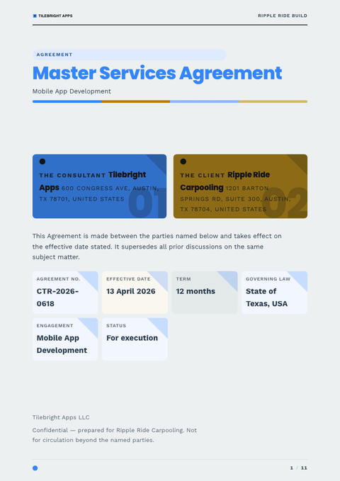
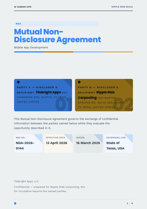
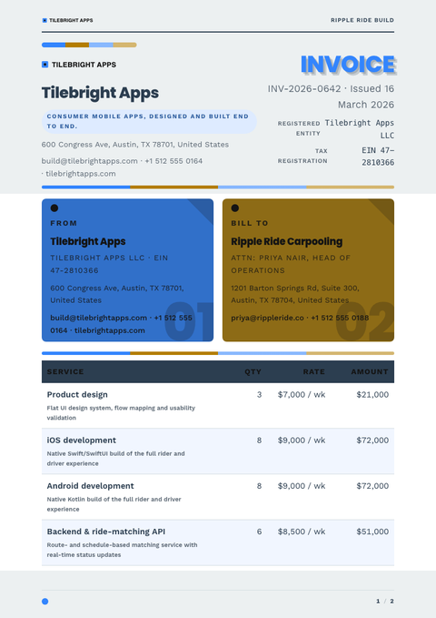
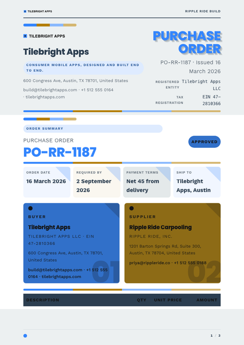
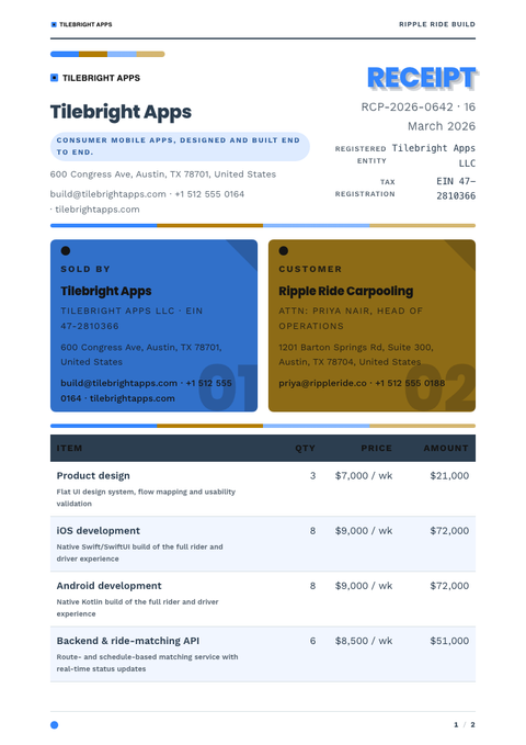
Flat Design trusts colour and shape to do the work that shadows and gradients used to do. It's post-skeuomorphic by conviction — no bevels, no drop-shadows, no faux depth — just solid colour fields and clean geometry standing on their own. On a scope of work, that reads as bright, direct and entirely unfussy.
Blocks of confident, saturated colour divide the page into clear zones, each one a flat tile rather than a card pretending to float. Corners are softly rounded, chips and pill shapes carry labels, and meter bars read at a glance without needing a legend. A clean geometric sans carries every size of text, keeping the whole scope of work feeling like one coherent interface.
This is the natural register for digital-first brands — SaaS, apps, startups — who want their paperwork to look as considered as their product. Reach for it when the scope of work needs to feel current and approachable rather than formal, and when clarity matters more than ceremony.
The strength of Flat Design as a scope of work is how well it survives being skimmed: colour-coded blocks let a reader find the relevant section without reading headings at all. Keep the palette to a handful of hues, though — flat colour has nowhere to hide once a sixth competing tone joins the page.
Here the colours are a placeholder set, chosen to show the system rather than any one brand. Waxe swaps them for yours — logo, palette, type — and returns a scope of work built flat, fast and ready to export under your own name.
More styles


Make this scope of work yours
Generate a Flat Design scope of work with your brand, your content and your logo — finished and ready to send.