
Flat & Minimal · Scope of Work example
Material You Scope of Work
Android / app / consumer-product and human-centred brands wanting Google Material 3 (Material You):
Best forAndroid / app / consumer-product and human-centred brands wanting Google Material 3 (Material You): one dynamic seed hue harmonised into pastel-tinted surface containers, extra-large rounded shapes, full pill buttons and chips, an expressive type scale and tonal layering for depth instead of drop-shadows.
- Style
- Tonal · Dynamic · Color
- Mood
- Soft · Friendly · Expressive
- Typography
- Sans-serif
Rendered by Waxe — not a template

What's inside
The Material You style sets the mood; this is the structure underneath. Waxe writes every section for you and lays it out to match your brand.
- Project summary & objectives
- Itemised workstreams & effort
- Deliverables
- Milestones & timeline
- Acceptance criteria
- Assumptions & dependencies
- Out-of-scope & exclusions
A closer look at Material You
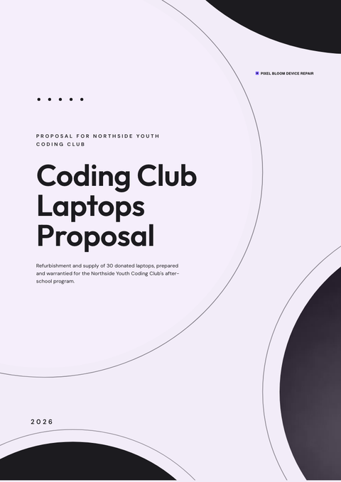
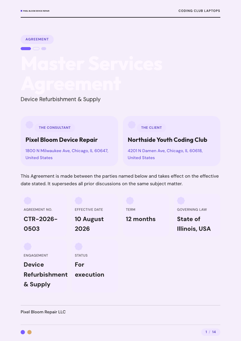
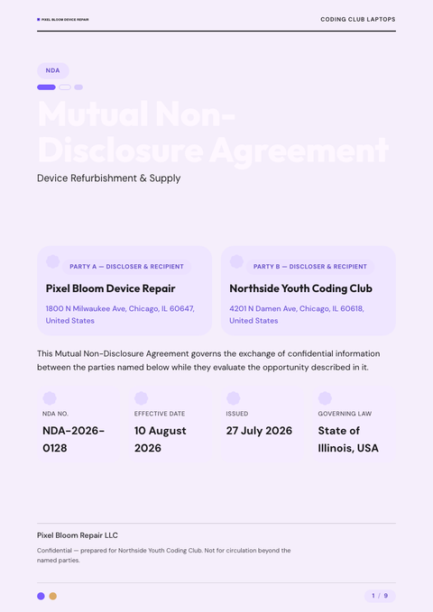
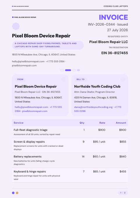
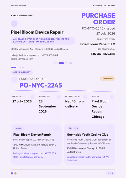
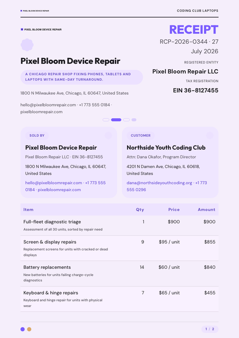
Material You softens the language of dashboards into something more human. Drawn from Google's Material 3, it takes a single seed colour and lets it bloom into a whole tonal family — pastel surfaces, layered containers, shapes that curve rather than square off. On a scope of work, the effect is soft, expressive and unmistakably friendly.
Depth here comes from tonal layering, not shadow — surfaces sit in slightly different shades of the same hue, stacked like sheets of coloured paper rather than lit from above. Shapes run extra-large and rounded, buttons and chips take the full pill form, and a clean sans moves through an expressive type scale that varies size and weight freely across the page.
It's built for consumer products, apps and human-centred brands that want a scope of work to feel personal rather than corporate, aimed at an individual rather than a committee. Reach for it wherever warmth matters more than gravitas.
The distinctive move in Material You as a scope of work is letting one seed colour generate the entire palette, so nothing needs matching by hand and the page still reads as a single considered system. Watch the contrast, though — pastel-on-pastel can get precious if two tonal surfaces sit too close in value.
The seed colour used here is a stand-in, chosen only to demonstrate the system. Waxe grows the real palette from your own brand hue, tuning every surface and chip to match before handing back a scope of work ready to send.
More styles


Make this scope of work yours
Generate a Material You scope of work with your brand, your content and your logo — finished and ready to send.